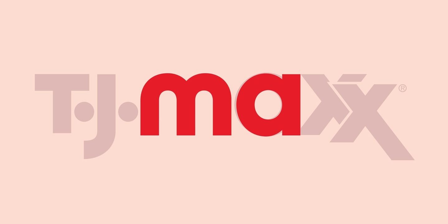
TJ Maxx, or TK Maxx as it’s known in the UK, has traditionally used Helvetica for its brand typeface. It was in good company in the US, where Helvetica “still dominates” in retail marketing, says Matt van Leeuwen, head of design at McCann in New York. Now, McCann has worked with Jeremy Mickel of MCKL Type and Design to turn the letter shapes of the TJ Maxx logo into a font.
The idea came as McCann was mid-delivery for the advertising campaign, Maxx What Makes You, You. “Anything we tried in Helvetica reminded us of other brands,” says Matt. At the same time, the team had great admiration for the retailer’s original logo; “It is so full of character and lovely idiosyncrasies, and as we started to apply that in big and bold ways in the design system we are developing, we simply had the bright idea to turn the letter shapes of the logo into a font.”
McCann hopes the new font will step into a “long history of strong modernist typography”. Matt says the blend of rounded forms and straight stems particularly brings to mind Herbert Bayer’s Universal Type, which began as an experiment in creating an all-lowercase typeface that could be drawn with a ruler and compass.