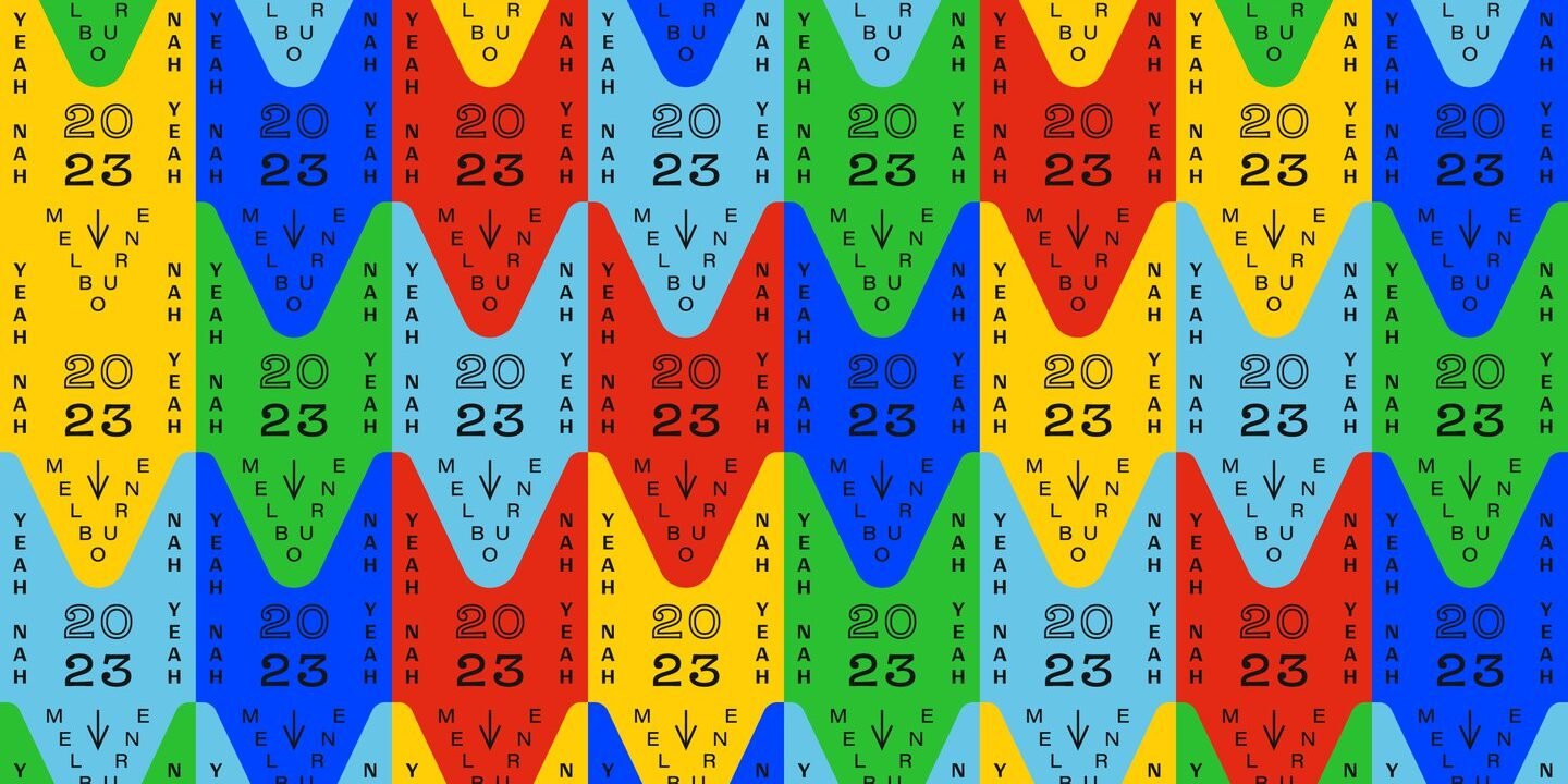
The unfiltered nature of the competition, and its famously inclusive atmosphere, sees a throng of hopefuls do battle at over 120 regional and national events each year. Proceedings are fast-paced and things can get heated with one winning title on the line. Luckily, the design and branding associated with the WAC sends out a friendly atmosphere which keeps the event feeling approachable. Angel & Anchor picks a different theme to guide the graphics each year, based on the location in which the international Championship is set. 2022, based in Canada, was ice hockey and the Olympics. 2023, which just rounded up in Melbourne earlier this month, is the Milk Bar.
“Milk Bars are the Aussie version of the UK’s corner shop or a New York-style bodega,” says Ben Connolly, CD and founder at Angel & Anchor. “Unfortunately, the Milk Bar isn’t as readily found these days and so holds an extra-level of romantic nostalgia.” Ticket stubs, fruit stickers and milkshake-esque aesthetics are all references that were lifted from the history of the Milk Bar and folded into WAC’s visual identity. “It’s unique to Australia but has enough relatable cross-over that it would work for the global context in which the competition is sat,” Ben says.
The design was a smash. To onlookers and competitors attending this year, the WAC felt like a brand dripping with energy and perspective. But most importantly, it was welcoming. Milk Bars are known for their signage and mismatched typography, and Angel & Anchor replicated this signature exterior facade for the event posters, adding a friendly dog. Elsewhere, recipe cards were mocked up in the style of crumbled receipts you might find in your pocket after a trip to pick up some milk – a lovely touch.


