[ad_1]
A few weeks ago, it was spring break for my kids, so my husband and I took them to Disneyland and joined up with my college friend Dave and his family. This detail is important because it is only because of Dave that we ended up staying overnight in a hotel at Disneyland—a first for me—and thus led to my ultimate discovery of the insane decor situation at the Grand Californian Hotel.
My family actually stayed at the Pixar Place Hotel, the cheapest of the Disney resorts, which is across the street from the Grand Californian, the most expensive of the Disney resorts. The latter is where Dave’s family stayed, because I guess Dave is rich and, I am afraid, he, whom I’ve known for nearly 30 years now, based on evidence I witnessed in person, may actually be a Disney Adult.

Disney’s Grand Californian Hotel & Spa.
When I first entered Dave’s hotel, it was very clear to me that its architect(s) had been to the Grove Park Inn in Asheville, North Carolina. For the uninitiated, the Grove Park Inn is a historic hotel built in 1913 in the Blue Ridge Mountains in the Arts and Crafts style, and it was outfitted in furniture, tableware, and whatnot by Roycroft, an Arts and Crafts firm based in East Aurora, New York, founded by writer Elbert Hubbard.
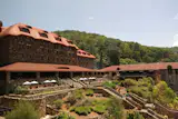
The Grove Park Inn in Asheville, North Carolina. I know the exterior is hobbit-y but it’s really the interior we’re talking about.
The Arts and Crafts movement is a broad term used internationally for artistic/design movements in reaction to the Industrial Revolution, when everyone got really into having everything handmade again and romanticized the labor of craft. I think technically it started in England in the late 19th century, and then cropped up in the United States at the turn of the century. Within the U.S., it has different ‘factions,’ if you will. There’s East Coast Arts and Crafts firms like Stickley or Roycroft furniture and objects, Tiffany Studios glass and lighting, and then there’s West Coast Arts and Crafts architects and designers like Greene and Greene—the brothers considered responsible for California bungalows—and Bay Area architect Bernard Maybeck. There’s also Frank Lloyd Wright in the Midwest, whose “Prairie Style” architecture straddles both Arts and Crafts and Modernism. He and Greene and Greene had a real hard-on for Japanese aesthetics, which also feature prominently in decorative arts during this time period, but I’m afraid that is about as detailed a history lesson as we have time for here because more urgently is the matter of Disneyland.
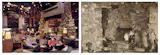
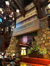
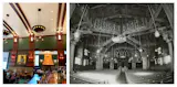
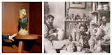
At left, the Great Hall of the Grand Californian Hotel in 2001; at right, The Grove Park Inn in the early 1900s.
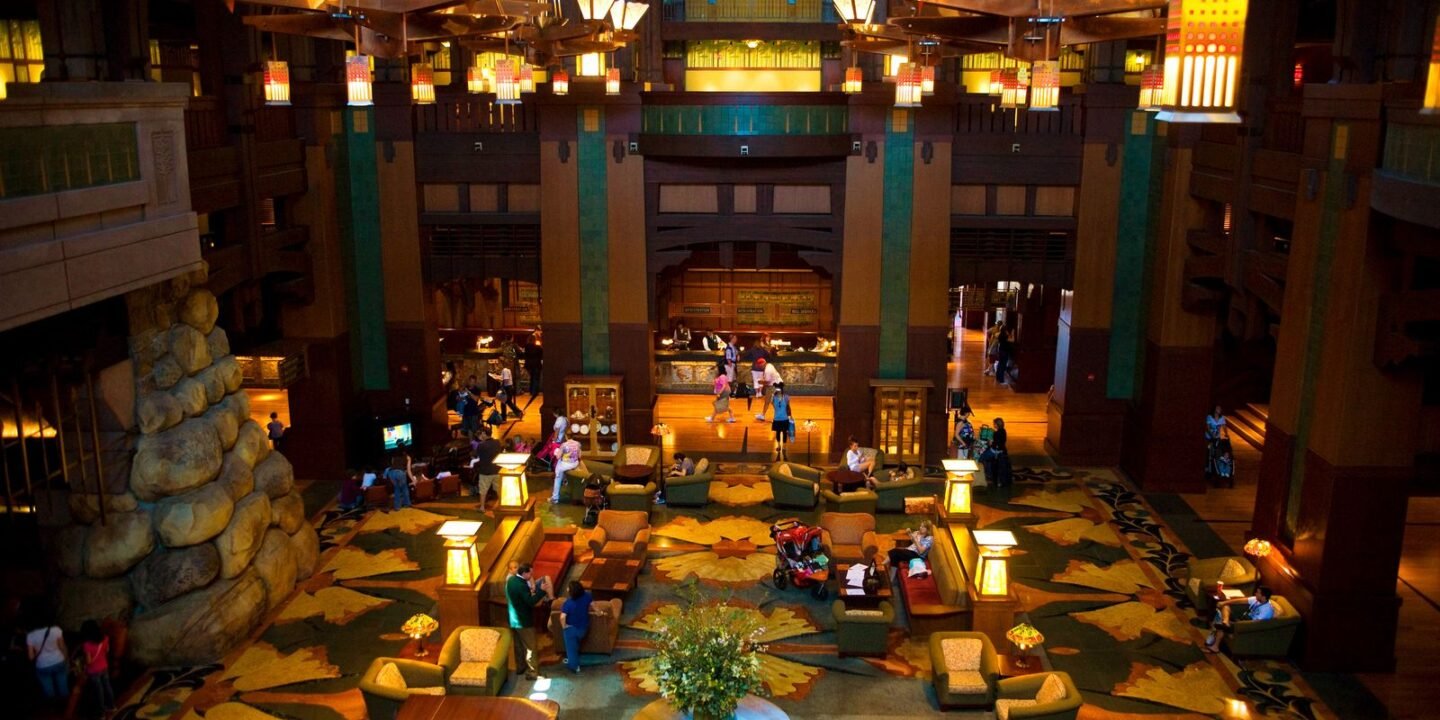
Fascinatingly (to me), the Grand Californian has definitely appropriated and jumbo-fied many of Grove Park’s signature characteristics: the giant boulders forming the entrance and grand fireplace; the grandiosity of the lobby with its Arts and Crafts–style seating and lighting; the cluster of Morris chairs (the general public calls this “Mission-style” furniture) surrounding the fireplace (even down to a child-size cluster of rockers surrounding a TV with cartoons on loop as though it were a fireplace itself).
But the Grand Californian is operating at like 17 times the scale. It also has a quarter-sawn oak Roycroft-looking tall case clock that seems 100 percent certainly based on the eight-foot tall Roycroft original clock in the Grove Park Inn.
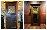
Left, the original Roycroft clock at the Grove Park Inn; right, the Roycoft-looking clock at the Grand Californian.
And both hotels have vitrines (glass display cabinets) along the perimeter housing artifacts of the respective buildings’ history.
But we were at Disneyland, and this hotel is from 2001, so what kind of historical artifacts is this lobby housing? There are four vitrines along the walls of the lobby—one with dinnerware and glass, one with ceramics, one with hammered copper metalware, and one with leather goods and books, each object inside looking antique and more or less period-correct.
The ceramics caught my attention so I bee-lined over to that vitrine and spied a vase that looked suspiciously like a Taxile Doat piece from his short time at University City Ceramics (quick info: Doat was a French ceramist who was an incredible glaze master. He was very famous in his home country, and did a short stint as a professor in University City, Missouri, in the early 20th century making wild crystalline glazes like this). If true, this would be quite a rare object for the lobby of a hotel at Disneyland!
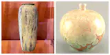
Left, the Taxile-Doat looking piece in question at the Grand Californian; right, a presumed Taxile-Doat piece made turn-of-the-century.
The more I thought about it throughout the day though (because this did actually occupy my brain during the moments I was waiting in line for rides at the park), the more I started to think they were likely props made to look period-correct. Disneyland is stocked with reproductions so it’s not a stretch to think they had a storeroom full of props from Geppetto’s workshop or wherever that they just threw in the cases. But traversing back through the lobby on my way home from the park that evening, I noticed that the books in the one vitrine were actual non-reproduction Roycroft and Elbert Hubbard scrapbooks. Real, and not props! Does Disney have a sick little collection in the hotel lobby and no one told me?
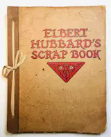
A copy of Elbert Hubbard’s Scrapbook, similar to the one on display at the Grand Californian.
By day two I’d involved actual employees of the hotel (again, not even my hotel) in my quest, who directed me to a guided tour titled “The Art of the Craft” which takes place every Tuesday and Wednesday at 2 p.m. for resort guests. In my mind I briefly imagined the Grand Californian had a resident collection curator, and I got very excited, but I was informed by the concierge that the tour was led by a rotation of front desk associates, so I had a pep talk with myself about not being insufferable and just asking normal civilian questions. Nobody in my party was interested in joining me so this is what I did by myself while everyone else went to the pool.
The tour guide, Angie, and I were joined by an older couple from North Carolina, one of whom bore a big Mickey Mouse button proclaiming it was her birthday. Angie started by asking if we were all familiar with the Arts and Crafts movement and everyone nodded. Interesting, I thought, eyeing the couple, collectors? Angie then led us to some historic black-and-white framed photos of the hotel under construction. One photo was of Bernard Maybeck and a construction crew on a building in San Francisco, while another was of Frank Lloyd Wright working on Fallingwater in Pennsylvania. Neither photo was of the Grand Californian (lol).
Angie explained that Maybeck and Wright were the influences of the hotel’s architecture, which was designed by Peter Dominick of Denver firm 4240 Architecture Inc. over half a century after those photos were taken. To Angie’s knowledge, the hotel was not inspired by the Grove Park Inn in Asheville; she had never heard of it before. Realizing that I worked with Dominick’s daughter for over a decade, and I should have briefly Googled some stuff ahead of joining the tour, I whipped out my phone and texted her “Did your dad ever go to the Grove Park Inn?” “Oh yeah he loved that place,” she replied.
Carrying on with the tour, Angie pointed out that the hotel is more or less a Megatron of Greene and Greene, Bernard Maybeck, and Frank Lloyd Wright’s aesthetics combined, and some wings of the hotel are more inspired by one architect than another. There was some talk about the building being meant to resemble a forest, then a tree, then moss on a tree, depending on what part of the building you’re standing in, and allegedly the conference center wing (can you believe the size of this place?) was based on Wright’s work because of the huge floor-to-ceiling windows. I don’t recall that being a major feature of Wright’s architecture but my fellow tour companions were nodding vigorously to this suggestion so perhaps they are more familiar with his oeuvre. Angie also pointed out a series of giant landscape paintings which were enlarged copies of apparently well-known plein-air paintings. These, also, were a source of inspiration for the hotel’s design. If you Google the hotel’s “Art of the Craft” tour, you will find multiple other interpretations of the inspiration for its design, including Sequoias, the Ahwahnee Hotel in Yosemite, and just the state of California in general, depending on who gives the tour.
While we were walking around the property, I had the opportunity to ask the couple in the group if they were collectors (no) and it turns out they frequent Disney cruises and resorts and are aware that Disney designs are always very intentional, so they join the tours to learn more. It delighted me that Disney was their gateway to learning about design history. It also delighted me that Disney had a tour for this at all. Sadly, it didn’t cover almost anything I was hoping it would, but Angie did mention that in a group she led years ago, a guest asked to see inside the case of ceramics because they believed their father had made a piece inside it and, indeed, he had. I made a light joke about being the second person to ask to see inside the case, but she laughed it off, so I did too.
When I asked about how the objects in the cases were assembled, or by whom, I was told that the Disney Imagineers—a term used to describe any of Disney’s 140 or so creative/technical employees who work on the company’s various properties—had sourced everything through an incredible amount of research. I was also informed about Disney’s outreach to global artisans; they ultimately selected about 30 craftspeople to work with on this project. No further information was given about these craftspeople, but from a quick Google of this tour, I found an oft-repeated, and honestly dubious, story about the ceramic frieze at the check-in desk depicting bears in football poses because the artist was a 49ers fan, which compelled me to do some fact-checking. Much of the information on the internet alludes to California artists being commissioned to work on this hotel, but on my tour, only one artist name was given specifically and it was Timothy Burrows, who designed three metal gates on the premises. His workshop is based in Missouri, so we know that the idea that the Grand Californian is all California craft is also not true.
So, a great deal of information is missing in this Disney design story. Thus, I’m proposing my own tour of the Grand Californian, which would be led by me, a person who has been one time, who did not get the opportunity to take anything out of a case to look at it, and who only saw things on the ground floor so God only knows what is upstairs, but who is, as you can see, a bit of a design enthusiast.

The hotel shortly after opening in 2001.
Presenting: The Official Meaghan Roddy Tour of the Grand Californian Hotel
The Grand Californian appears to be based predominantly on the Grove Park Inn in Asheville, North Carolina, a place the chief architect, Peter Dominick of 4240 Architecture in Denver, Colorado, frequented and loved. At the peak of Disney’s Renaissance, when Michael Eisner was at the helm, Dominick, to whom Eisner was introduced via their mutual friend Robert A.M. Stern, was charged with designing three major Disney resort hotels: the Wilderness Lodge of 1994, inspired by the National Parks, the Animal Kingdom Lodge of 2001, based on African kraal architecture (both are located at Walt Disney World in Florida); and the Grand Californian, Dominick’s only hotel in California.
Dominick and his partner at 4240, Randal Johnson, were the interior architects for the main lobby and the check-in area. Richard Brayton, of BraytonHughes Design in San Francisco, was the interior designer for the guest rooms, hallways, and lobby bar, and was responsible for all of the furniture in the lobby. Marty Dorf, of Dorf Associates in New York City, was the restaurant designer. Of all of these gentlemen, who worked on a number of Disney projects together, the only surviving designer of this incredibly massive undertaking is Johnson.
In the absence of information about almost any of the artists involved, which I was not able to find anywhere online or at the hotel itself, I will do my best to tell you what you’re looking at the next time you find yourself inside the Grand Californian.
First, the old stuff. While I was left under the impression from my tour that Disney Imagineers were responsible for the bric-à-brac, it would seem that actually 4240 was. This would track because, of the labels I could read on the underside of pieces in the cases, they were made by contemporary ceramic companies based in Colorado.
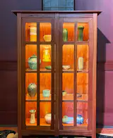
A vitrine at the Grand Californian.
The first vitrine is filled with an array of random non-matching dishes, pitchers, teacups and whatnot, in various antique-looking decorative transfer-printed patterns, some looking pretty Art Nouveau, and pretty British to me, and at least one identifiable Rosenthal Bavaria Stein from 1910 to 1930, and one Limoges partial tea set made between 1891 and 1938. It was nearly impossible to see the stamps on the underside with the lighting and placement, but I did my best to absolutely humiliate myself by getting down on my hands and knees in a hotel lobby to look under the shelves. The top row has four glass vases, at least one looks like Loetz, an Austrian glass piece from the early 20th century. Who can say for sure! But my guess is the designers were trying to make it look like Tiffany glass and whatever Loetz or Loetz-like stuff they found on Ebay was cheaper. Also, they could have been made by any contemporary glassblower, how is one to know when one is not allowed to open the case?
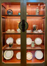
A vitrine at the Grand Californian.
The next vitrine, the one with the ceramics, is a little bit more of a mystery. I think all of these, with the exception of two, are contemporary pieces made to look like period pieces. The vase in the lower left corner is technically the only period correct piece in the case, a Roseville “Mostique” Arrow vase made in Zanesville, Ohio, in 1915-1916ish. But it’s what we’d consider ‘the look for less’ since it was the cheaper mass-produced version of the nicer Arts and Crafts ceramics being made at the time, like Rookwood handmade vases from Cincinnati, Ohio. (Roseville is the Pixar hotel to Rookwood’s Grand Californian.) There’s another Roseville piece in the case—a “Zephyr Lily” covered jar, but sorry friends, the Zephyr Lily pattern wasn’t introduced until 1946 and thus is not period correct to this project!
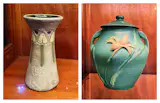
Roseville ‘Mostique’ vase, I can’t believe I’m writing about Roseville; Roseville ‘Zephyr Lily’. Humiliating to know so much about Roseville.
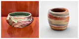
The other pieces are hard to make out but the majority look to be by Ephraim Pottery from Wisconsin and Garden of the Gods Pottery in Colorado. I have never heard of either of these, but I could see their stamps, which is the only reason I’ve identified them. They are all made to look like a slew of Arts and Crafts pottery firms like Grueby, Walrath, Van Briggle, Saturday Evening Girls, Fulper, and some of the deeper cuts like Niloak, North Dakota School of Mines, Redlands, etc.

Left, a Lorelei Vase, made in Colorado Springs, Colorado in 1902, by The Van Briggle Pottery Company; right, green matte glaze is super common for a slew of Arts and Crafts period ceramics but this one at the hotel looks pretty close to Van Briggle.
My pipe dream of finding a rare Taxile Doat UC piece at Disneyland is almost certainly not possible, but since we can’t make out the underside to confirm or deny, I think it’s okay to have a little hope here and there, so I’m going to go ahead and let myself have this, as a treat.
Left, no idea who made this but I am a little bit delighted to see fake Niloak; right, a small cup from the early 1900s by Niloak Pottery.
The metalwork cabinet is a real crapshoot. Everything looks like hammered brass patinated to look like copper done in the way only Marshall’s could, so I think it’s safe to say we don’t need to look in here too long. There are a couple authentic Elbert Hubbard scrapbooks from the 1920s in there, which we also see in the cabinet of books and leather artifacts.
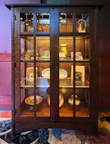
The metalwork cabinet at the Grand Californian.
This fourth cabinet wins for most authentic with the Roycroft books and leather goods, and this, for me, is what gives the Grove Park Inn a direct line to the Grand Californian. The interiors of the Grove Park Inn were outfitted with Roycroft dinnerware, books, furniture, and objects—those are the historic artifacts lining the walls of the Grove Park Inn’s hallways. This is Peter Dominick’s clearest nod to the Grove Park Inn.
Now, onto the artworks that were made by unnamed contemporary artisans specifically for this hotel.
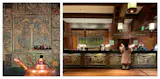
Left, original tiles by Ernest Batchelder and friend Maria Tappe decorate a wall in the kitchen of his one-time residence. Right, the front desk at the Grand Californian.
These are the aforementioned tile friezes at the check-in desk, which, I discovered via an old interview with Dominick from the Grand Californian’s ribbon-cutting ceremony, were made by Susan Dannenfelser, a Bay Area artist. The bears represent the four seasons, they’re dancing, and they’re made in the style of Batchelder, a California tile company founded by Ernest Batchelder in Pasadena in 1909, and which gained some press of late due to the fires in Altadena and the discovery of surviving and salvageable original tile friezes around fireplaces in houses that had lost nearly everything else.
The tapestries mounted on the walls behind the desk are by Laura Foster Nicholson, a textile designer based in Indiana, and appear to be modeled off of Eliel Saarinen designs woven by Studio Loja Saarinen at the Cranbrook Academy of Art, the very school Nicholson attended.
Lamps on the front desk at the Grand Californian.
The lamps at the front desk are riffs on Elizabeth Burton lamps, as well as Tiffany Studios lamps, with lots of liberties taken. The contemporary Burton lamps depict animals and other creatures indigenous to California, like the quail, snail, and whatever the other stuff is, and then there is one inexplicably red lamp that, allegedly, according to the tour, Peter Dominick included as an homage to Frank Lloyd Wright (?? sure). This reminds me of the time I ordered guacamole in a Mexican restaurant in London and it had mayonnaise in it. Like, one person’s interpretation of Wright (guacamole) is not at all my interpretation of it.
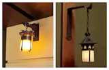
Left, a Grand Californian lantern; right, a Gustav Stickley sconce from the early 1900s.
The lanterns in most of the passageways are based off of Gustav Stickley lanterns.
The absolutely steriodial fireplace at the Grand Californian.
There’s lots of green tile that references Grueby tilework, and again, a giant Batchelder-style tile frieze atop the enormous fireplace.
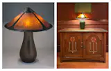
Left, a Dirk Van Erp. Lamp, circa 1912 to 1915. Right, the lobby furniture at the Grand Californian.
The lobby furniture by check-in looks like a play on Harvey Ellis for Gustav Stickley, which is a nice little deep cut for the heads because Ellis, famous for his inlay work, only worked for Stickley for like a hot second (literally seven months!) so it’s what we in the biz would call rare. And the lamp here is a hybrid of a Dirk Van Erp shade on a Grueby ceramic base. This combination does not exist in nature, but at Disney, no rules just vibes.
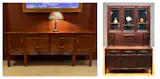
Left, a sideboard in the lobby of the Grand Californian; right, a Greene and Greene Cabinet in the Cleveland Museum of Art collection. The level of detail had me SHOOK.
Other sideboards in the lobby are based on Greene and Greene, and feature strikingly detailed reproductions of their signature cloud lift motif and ebonized joinery.
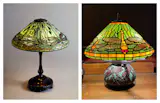
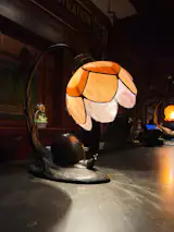
Left, Dragonfly table lamp from 1900, by Clara Driscoll, Tiffany Studios; right, a Grand Californian Tiffany.
The lamps around the lobby are all meant to look like Tiffany Studios, and even modeled off of specific patterns like “Dragonfly,” “Poppy,” and “Acorn,” but as with all Tiffany copies they are a little heavy-handed. There’s even a giant Tiffany Studios-style window, complete with a “hidden Mickey” in the corner.
Left; Mickey Maybecks at the Grand Californian; right, original Maybecks in the First Church of Christ, Scientist in Berkeley in 1978.
The lanterns and wall lights in the restaurant are based on lights designed by Bernard Maybeck for his First Church of Christ, Scientist, in Berkeley, California, in 1910, but the Grand Californian has transformed the trefoils of the original into Mickey silhouettes.
Left, the interiors of Swedenborian Church in Pacific Heights; right, the check-in alcove at the Grand Californian.
Maybeck’s influence is also seen in the check-in alcove. Here, there are redwood tree trunks forming the ribcage of an archway, though these are faux wood props, the one major artifice of the hotel that looks most like a Disneyland ride. This is based on the Swedenborgian Church in San Francisco of 1895, on which Maybeck was a contributing architect.
Left, a R.W. Martin & Brothers-inspired piece on display at the Grand Californian; right, the Martin Brothers making pots.
The lobby is dotted with a couple ceramic bird sculptures, which allegedly are also present in the elevator banks of the other floors but I wouldn’t know because I wasn’t allowed upstairs because I wasn’t even really supposed to be there in the first place. These, I’ve learned, were also made by Susan Dannenfelser, and were referred to by her as “California Natives,” so presumably these are birds native to California. These are based on tobacco jars by R.W. Martin & Brothers, aka Martin Brothers, often called Wally Birds.
Disney’s level of detail has given us quite a lot to follow. But I have to say: I was impressed! In the words of a very well-respected design and decorative arts curator at a major American institution whom I shan’t name lest they be outed as a Disney Adult: it is embarrassing how much I want to be an Imagineer. If it means that this is what I could be doing with my day— recreating a historic property with zero purist restrictions and running absolutely amok with imagination to create a space of total awe that would delight a neophyte traveler and stop a 20th-century decorative arts specialist in their tracks—then yeah, I would probably apply for that job. I am confident nobody, including and perhaps especially me, expected our short stay at Disneyland to lead me down this absolute rabbit hole but I am about to say something very positive about Disney and Disney Adults: I had fun.
Top Photo by George Rose/Getty Images
[ad_2]
Source link