[ad_1]
The design, photography and colourways have a welcoming feel. It’s a way of galvanising the younger audience toward aiding in the prevention of later stage diagnoses, but also to show that this prevention is a joyous experience. Throughout CoppaFeel!’s work it aims to maintain a positive spirit, and the Livity team knew it was paramount to reflect this from the start. “Our initial concept for the design was ‘urgent squish’”, a concept that hinges off CoppaFeel!’s urgent messaging to get people to check their bodies for early signs of breast cancer, Lucy shares. “I always knew the logo, which we developed with the amazing typographer Tina Smith, had to be squishy and tactile”, leading to an animation and visual metaphor for the act of squishing the breast. But that’s not all there is to the type, there is also the use of Dunbar for its strong and rigid quality in order to “drive home that urgency”, Lucy adds.
In regards to the development of the design, Livity employed its regular approach which includes in-person research sessions with young people. “I find that diverse youth perspectives drive innovation and bring forward solutions that resonate with contemporary audiences,” Lucy tells us, which we could only imagine is especially beneficial for a project like this. And the high spirits didn’t stop at the design; it also conducted a day-long photoshoot with an “incredibly inclusive and passionate cast” directed by Jane MacFarlane and shot by Naomi Wong. The campaign reflects not only the power of CoppaFeel!’s message but the synergy among the team, and their belief in said message. “We wanted to make sure the educational message was delivered to the audience in a relatable and reassuring way to demonstrate how easy it is to self-check and encourage more young people to get into the habit of checking their chests,” Lucy adds.
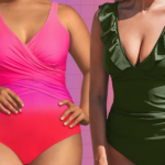
The agency’s approach to developing the tone of voice was also a careful fusion. “We had to strike a balance between its signature playfulness and the urgency of the message, without ever straying into fear mongering,” Rachel Kendrick, creative director at Livity, tells us. So the team opted for a sentimental approach that captures both – the Maren sisters’ story, with special emphasis on the figure of the ‘caring older sibling’. “They know you, they love you, they want what’s best for you, and if you find something suspicious on your chest they will make you call the GP, no matter how scary the receptionist is.” And as for the illustration, Livity wanted to give the charity a functional set of icons that showcased the different types of breasts and chests. “Developed to be interchangeable, accessible and diverse in every sense,” says Lucy.
For Livity, the only challenge was in knowing that it had to do such an impactful cause justice. But, the challenge has been nothing in comparison to the reward of achieving just that. “I hope people feel drawn to engage with the amazing work the charity does,” Lucy says, “and check your chests!”
[ad_2]
Source link