[ad_1]
Curated by designer and historian Ian Lynam, the exhibition is the result of 15 years of in-depth research into how visual design has changed across a century in Japan, particularly in how notions around cultural identity and modernity have been translated into image. To achieve this, Lynam worked with museums and archives in Japan, Australia and North America to procure rights to works. He also sought out help from friends who are collectors; but mostly, he says, he found “incredibly rare” items to research.
“A theme that continues today is the national fascination in Japan with what is ‘Japanese’ and what is ‘other’,” Lynam tells Creative Review. “These are expressed through the prefixes ‘wa-’ for Japanese things and ‘yo-’ for things that are foreign, even though those things are often mixed-up today.
“For example, ‘yoshoku’ means ‘foreign food’ or ‘Western food’, but most yoshoku restaurants both in the past and today feature dishes that are very Japanese takes on what is considered ‘foreign’. These ideas of what is ‘Japanese’ transcend graphic design in Japan, but are also part and parcel of visual aesthetics.”

The exhibition comes with a book of the same name, featuring items – notably old posters – that Lynam wasn’t able to feature in the exhibition due to rarity. In the book, an illustration on a magazine cover of a topless male guard is set against a pink background. He’s wearing a police cap with the word ‘Guard’ painted in white across it. The cover states it’s ‘No 13’ in a series and costs 300 yen. It’s marketed towards ‘youngmen & guys’.
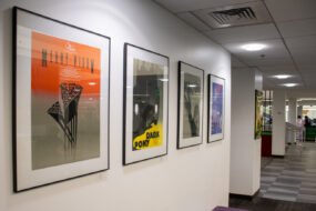
On one page, a mixture of kanji, hiragana and katakana characters are portrayed through black broad strokes intersecting with thin lines; on another, each line is given the same width. There are archive record sleeves, cartoons, illustrated magazine covers, photographs and more.
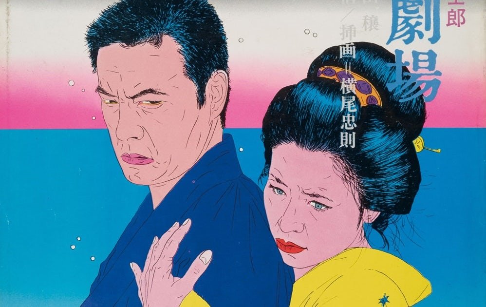
Ukiyo-e printmaking is explored in depth, particularly in how it flourished in Japan prior to the country reopening to the West after the Meiji Restoration that began in 1868. Lynam highlights how significant designers such as Yokoo Tadanori, Awazu Kiyoshi and Hirano Kōga took this style into contemporary times.

A highlight that Lynam points out are the number of items produced by the Tsukiji Type Foundry, Japan’s very first commercial type foundry. “Finding examples of their work is very difficult,” he elaborates. “One book in the exhibition was found in a mouldy old bookstore and was purchased very affordably, whereas another was purchased online for the equivalent of my monthly rent on my apartment. Both are sensational items: one is an early English language-learning textbook and the other is a type specimen.”
It’s through this extensive deep dive that Lynam was able to trace narratives that are historically overlooked, including by the Japanese design press. “To speak in cultural specifics, Japanese culture is straight, male-dominated and histories of feminism and queerness are largely ignored,” he says.
“Graphic design is obsessed with its male creators,” he continues, “from dominant cultures who function as Modernist advertising-oriented hero figures. By including the unknown and those whose work was widely seen but little-acknowledged, we can get away from rudimentary narratives of histories based on past methodologies and open up critical ways of seeing history as it actually is: something made by many different kinds of people.
“I have tried to tease out a more egalitarian history,” he adds, “as it is one that reverberates through Japanese culture and society today.”


Fracture: Japanese Graphic Design 1875–1975 is on show at Kura Gallery in Tokyo until July 26; kura.ultrasupernew.com
[ad_2]
Source link