[ad_1]
This year has produced a glorious array of movie posters, and although there was plenty to admire in the brash marketing of big budget franchise fare – there was some interesting work around Tron: Ares and Thunderbolts, for example – it’s perhaps telling that the most eye-catching creativity can be found promoting lower budget films that don’t have recognisable IP to fall back on.
Showcasing a variety of creative techniques and approaches, these films are doing unexpected, brilliant things to get people into the cinema.
Sentimental Value; Design: Empire Design
Empire Design’s tightly cropped and claustrophobic poster for Joachim Trier’s Sentimental Value reflects the film’s themes of patriarchal control and reframing generational trauma. Within this unconventional visual hierarchy, characters avoid one another’s gaze, but remain contained, tethered. The result is one of the year’s most striking, original posters.
Armand; Design: Akiko Stehrenberger
Renate Reinsve appears in Akiko Stehrenberger’s artwork for Halfdan Ullmann Tøndel’s psychological drama Armand, drawing upon the madness displayed in one of the film’s dance sequences. What could have been a simple photographic image, the painted brushstrokes tease the film’s interrogation of reality; Sander Brouwer’s title treatment further pushing the disconcerting ambiguity with hybrid serif/sans lettering.
The Thing With Feathers; Design: Uncommon Creative Studio
Deviating from Eleanor Crow’s iconically avian artwork for Max Porter’s source material, Uncommon have given the poster for Dylan Southern’s The Thing With Feathers its own identity by shifting the focus onto Benedict Cumberbatch’s character; talons of grief scratching tears into the paper itself.
Frankenstein; Design: James Jean
Following his work for The Shape of Water and Pinocchio, artist James Jean continues his creative partnership with Guillermo del Toro, producing this poster for the Imax release of Frankenstein. Weaving the film into the anatomical art of Jacques-Fabien Gautier-Dagoty, it’s wonderfully visceral.
But with an Instagram reveal via Hideo Kojima, behind-the-scenes process videos, and an amusing appraisal from the director himself, perhaps it’s everything about the poster that really makes it a valuable marketing tool.
Bugonia; Design: Vasilis Marmatakis
Yorgos Lanthimos and Vasilis Marmatakis is another director/artist combination that has produced some of the most visually arresting film art of the last ten years, from the much-imitated poster for The Lobster to the baroque surreality of Poor Things.
For Bugonia, they draw upon the eponymous myth of the title; the idea that a swarm of bees could spontaneously generate from the decaying carcass of an animal. As Marmatakis told Wallpaper about the image of Emma Stone awash with blood and honey, “the idea is that you don’t know if she’s in desperation or if she’s in awe.” Combined with a revival of Joseph Churchward’s typeface Churchward Roundsquare, the whole thing looks … alien.
The Chronology of Water
The upward gaze into oppressive red of Bugonia’s poster is curiously mirrored in that of The Chronology of Water, based on the 2011 memoir of the same name by Lidia Yuknavitch, charting her journey from Olympics-hopeful to writer.
Following the film’s Cannes Film Festival premiere, Offscreen’s M Sellers Johnson wrote: “Kristen Stewart’s blistering debut will surely prompt divisive discourse on its aggressive art film aesthetics, challenging violent and sexual material, and close lens on the topic of trauma … but for all its experiments and deliberate provocations, the film finds itself grounded in deep, personal meaning.” This translates into an aptly unconventional and coarse design; Imogen Poots’ Yuknavitch caught in what could be a primal scream or a moment of serenity.
Time To The Target; Designer: Maxsym Palenko
“The time it takes for these missiles to reach their targets now shapes the life of every Ukrainian.” In Time To The Target, Vitaly Mansky has documented life in Lviv, far from the front lines of the Russia’s invasion, but where people’s daily existence is still affected by the constant threat of devastation from above. This is hauntingly illustrated by the poster, a shadow of death cast over a sea of people going about their lives.
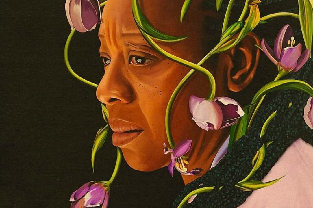
Hard Truths; Design: Desi Moore
In the poster for Mike Leigh’s tragicomic Hard Truths, Marianne Jean-Baptiste’s abrasive and flower-averse Pansy is reluctantly beset with a floral crown. Desi Moore’s painted portrait manages to convey melancholy and absurdity – even more so in the awards season version of the poster, in which Jean-Baptiste is juxtaposed against scores of ‘Winner’ laurels.
Pillion; Design: Empire Design
BDSM biker romcom may not be the easiest genre to sell, but Empire Design has struck a fine balance of intrigue and clarity in this pair of posters for Harry Lighton’s Pillion. There’s an economic elegance in the selection and pairing of these images, selling the relationship between Harry Melling and Alexander Skarsgård’s characters with little but expression and costume … if a lock and key can be considered costume?
Grand Tour; Design: Irene Lee
Writing for Variety at the Cannes Film Festival, Jessica Kiang called Miguel Gomes’ period romance Grand Tour, “an enchanting, enlivening, era-spanning, continent-crossing travelogue that runs the very serious risk of infecting you with the antidote: a potent dose of wanderlust-for-life.” For its international release poster, Irene Lee’s poster leans into the film’s grainy black and white 16mm photography, but immerses it in a vibrant sea of colour and type.
[ad_2]
Source link